🌈 Ink Swatches! My Swatchbook
I'd like to share how I handle swatching inks! I have a couple of ways I do this, mainly a quick way and a more detailed way that I keep in a swatch "book."
The first way is the basic one; I just use a cheap paint brush and do a line across a page. This is mostly for previewing samples, as I may not end up getting the full bottle (obviously) so I don't want to dedicate a full page to it in my swatch book. They are pretty fun to look at on their own, though, but I don't necessarily feel that I need to keep these long term.
I know a lot of people do their swatches with cotton swabs, but since I already have a bunch of paint brushes on hand (including some cheapo ones that I never use anymore, except to paint with my boyfriend's four-year-old), I just stuck one in my pencil bag and that's what I use here. When I first got into fountain pens, I saw everyone using cotton swabs and wasn't sure if there was some sort of reason to prefer them over paint brushes, but I came to realize that a lot of people... don't just have random paint brushes lying around already, haha.
The other way I swatch is the "book" I mentioned. It's not a full book, but rather an insert in a knock-off Traveler's Notebook I have. Once I fill it up, I'm sure I'll start another insert, but I haven't finished my first one yet. It took me some time to think about what I wanted out of a swatch book, and I decided the biggest benefit would be keeping a record of how an ink behaves in a specific pen. So I decided on a TN insert where I can dedicate a page to one ink, and then keep a record of how a pen behaved when that ink was put in it. I use two tools: my paint brush and a dip pen.
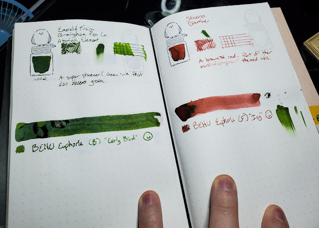
A two-page spread of the book. My Birmingham Emerald Fusion swatch has made quite the mess, which isn't actually a problem - because the intention of the book is to show me how each ink behaves in different scenarios, and this just reminds me of how unweildy that sheener can be!
I start each page off with my little bird stamp, just for that little touch of personality - it's the first thing I see on each page. I fill the ink bottle of the stamp with my paint brush, trying to pool more of the ink toward the "bottom" of the ink bottle in the image. Sometimes this doesn't work out well, but I view that as a good thing, because it shows me what inks will let me do that easily and which ones won't, which is in itself an indicator of how that ink likes to behave. I also include that same brush stroke across the page to show a big example of how the ink looks when it's lighter. Below the stamp I note the size of the bottle I have, because some of these inks are written in kanji and I cannot remember which is which. So having the size handy might help me find the right one. 😉 I also used to record samples in my insert, so knowing quickly that I don't have a full bottle was also nice.
I record the name of the ink and brand, of course, at the top of the page. Some inks also have additional info; if the ink is part of some sort of set or has a noteworthy classification from its brand, it might be mentioned here. That's a long-winded and vague way to say that for Birmingham's mixable inks, I just noted whether or not the ink was an "atomink element," which means it's a base color and not a mixed color. In theory I could also use this space to note other things, but that's the main "other" thing I include by the name right now.
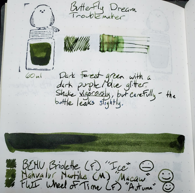
After the name, I do a shading test with some scribbles, followed by a water test and a smear test. I don't go as in-depth with my smear test as Mountain of Ink does, because I don't feel that I need to for myself. I basically just draw five horizontal lines and then quickly run my finger down them. Just that amount of time gives varied results and can be enough to show me that an ink might take some time to dry. The cross-hatch lines are then put on and I get my water brush to finish off. The water test is important to me as I really enjoy drawing with my pens, and I love water-pliable inks, since it lets me create some really fun doodles.
After all that, I write a short description about the ink. Whatever I know at the time, and later if I learn something else, I can fill it in. So I make sure to give myself plenty of space. Some inks don't have all that I need to note, but others do, so I typically will start with a short description of the color. This is where I'll note things like sheen and shimmer, and if I know the ink is dry or wet. I'll also often describe the water behavior, since sometimes it can help clarify what I'm seeing with the water test.
After the paint brush swipe is where I make a record of how pens behave with the ink in them. The page itself serves as a sample with the dip pen, so I don't ever record that. I scribble in a quick square in the dot grid, write the name of the pen, a quick note about the nib size (and if it's a gold nib, the karet of it too), along with my nickname for the pen. Some of my pens' nicknames are just the colorway the maker named them, and others are ones that I just think of whenever I see that particular pen. The other final touch is I note how the pen and ink pair together. For this, I use a sophisticated, scientifically formulated rating system I've come up with: 🙂, 😐, 🙁.
Which are defined as follows:
🙂 - The smile! If the pen and ink play just as I expect them to, without any problems, and the ink looks acceptable, it gets a positive rating. This means shimmer/sheen show correctly, there are no hard starts, the ink is a legible color and/or darkness, etc.
😐 - The neutral face. This one is "agreeable." The pen and ink work, but something isn't good enough to give it a full on smile. Maybe the ink is just a bit too light, like it's legible but not as dark as I'd hoped. Maybe the ink flows fine, but the shimmer isn't coming through consistently. This basically signals to me I could use these two together again, but it's not really what I want for this pen or ink.
🙁 - The frown. It's exactly what you think it is. Hard starts, poor flow, shimmer/sheen just don't work at all, and other problems. Maybe this ink is a "dry" ink, and this pen only really works with "wet" inks. Whatever the case, this pairing should be avoided in the future!

The swatch page for one of my top favorite inks, Sailor Manyo Yamabuki. I like this ink so much that it's often a first-stop for testing out new pens.
I know a lot of folks match their pens and inks together, and I may do that now and then, but I want to avoid feeling like I need to do that. I want to use inks in pens that play nicely together, regardless of the color matching. (If they do match, that's a plus though!)
Later on I'd like to share swatches of inks as I get them, maybe talk about individual inks that I like! Sailor Manyo Yamabuki in particular is one that I'd be happy to gush about in a post, so maybe I will, haha.